Routes
Routes represents an array of clickable icons that redirects to a given path. Each item in the array should contain the following configuration:
| Name | Type | Default | Description |
|---|---|---|---|
url | string | Required* | The path to a Lovelace view. Ignored if tap_action is defined. |
icon | string | JSTemplate | - | Material icon to display as this entry icon. Either icon or image is required. |
icon_selected | string | JSTemplate | - | Icon to be displayed when url matches the current browser URL |
icon_color | string | JSTemplate | - | Custom color for the icon of this route. |
image | string | JSTemplate | - | URL of an image to display as this entry icon. Either icon or image is required. |
image_selected | string | JSTemplate | - | Image to be displayed when url matches the current browser URL |
badge | Badge | - | Badge configuration |
label | string | JSTemplate | - | Label to be displayed under the given route if show_labels is true |
selected | boolean | JSTemplate | - | Controls whether to display this route as selected or not. If not defined, the selected status will be computed as route.url == window.location.pathname |
selected_color | string | JSTemplate | - | Custom color for the route when it is selected |
tap_action | CustomAction | - | Custom tap action configuration. |
hold_action | CustomAction | - | Custom hold action configuration. |
double_tap_action | CustomAction | - | Custom double_tap action configuration. |
popup | Popup items| JSTemplate | - | List of routes to display in a popup menu |
hidden | boolean | JSTemplate | - | Controls whether to render this route or not |
info
url is required unless tap_action, hold_action, double_tap_action or popup is present.
info
If tap_action is defined, url is ignored.
tip
Some suggestions when using the image property:
- Place your custom images in the
<ha-config-folder>/wwwdirectory - Use images with a transparent background for best results
- Keep image dimensions squared for best results
Badge
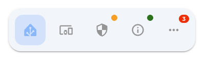
Configuration to display a small badge on any of the navbar items.
| Name | Type | Default | Description |
|---|---|---|---|
show | boolean | JSTemplate | false | Boolean template indicating whether to display the badge or not |
color | string | JSTemplate | red | Background color of the badge |
count | string | JSTemplate | - | Text to be displayed inside the badge |
textColor | string | JSTemplate | - | Color for the text displayed inside the badge |
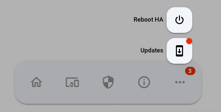
Popup Items
For each route, a popup menu can be configured, to display a popup when clicked. This is activated using the open-popup action in either tap_action or hold_action.
| Name | Type | Default | Description |
|---|---|---|---|
url | string | Required* | The path to a Lovelace view. Ignored if tap_action is defined. |
icon | string | JSTemplate | - | Material icon to display as this entry icon. |
icon_selected | string | JSTemplate | - | Icon to be displayed when url matches the current browser URL |
image | string | JSTemplate | - | URL of an image to display as this entry icon. |
image_selected | string | JSTemplate | - | Image to be displayed when url matches the current browser URL |
badge | Badge | - | Badge configuration |
label | string | JSTemplate | - | Label to be displayed under the given route if show_labels is true |
selected | boolean | JSTemplate | - | Controls whether to display this item as selected or not. If not defined, the selected status will be computed as item.url == window.location.pathname |
selected_color | string | JSTemplate | - | Custom color for the route when it is selected |
tap_action | CustomAction | - | Custom tap action configuration. |
hold_action | CustomAction | - | Custom hold action configuration. |
double_tap_action | CustomAction | - | Custom double_tap action configuration. |
In addition to the default annotation, we also support using JSTemplate to define popup items. For example, you can dynamically define items based on the areas in your Home Assistant environment:
- icon: mdi:sofa-outline
  icon_selected: mdi:sofa
  label: Rooms
  tap_action: { action: open-popup }
  popup: |
    [[[
      return Object.values(hass.areas).map(area => ({
        label: area.name,
        url: "/d-bubble/home#" + area.area_id,
        icon: area.icon
      }));
    ]]]